VetIT UK — Practice Management Heuristic Audit
A structured UX audit of a veterinary practice management web app, evaluating usability, accessibility, and interface design against Nielsen's heuristics, WCAG 2.1, and core Laws of UX.
- Role
- UX Audit · Web
- Tools
- Figma
- Team
- 7 designers
- Year
- 2026
Overview
As part of a capability demonstration exercise at Madison, our team conducted a structured UX audit of VetIT UK's veterinary practice management web application. The audit evaluated usability, accessibility, and interface design against established UX principles, including Jakob Nielsen's 10 Usability Heuristics, WCAG 2.1 accessibility guidelines, and core Laws of UX.
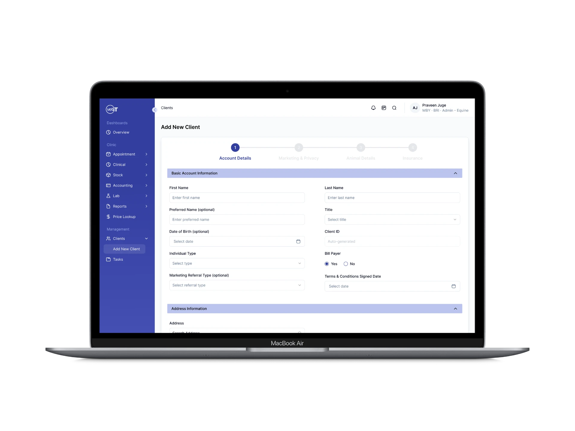
The audit was split across the team, with each person auditing a different part of the product. I owned the Add New Client flow — the process clinic staff use to register a new client and their animal into the system — from initial evaluation through to a hi-fi redesign proposal.
Context / Opportunity
VetIT UK's Add New Client flow is a core, frequently-used task for clinic staff — every new client and patient has to go through it. Because it's high-frequency, small amounts of friction compound quickly: extra steps, unclear field grouping, or ambiguous input types don't just slow down one task, they slow down every front-desk interaction across a clinic's day.
The goal of the audit wasn't to redesign VetIT UK's product for them, but to demonstrate what a structured, principle-based evaluation looks like — identifying concrete, prioritized issues and pairing each one with a clear rationale grounded in known UX heuristics, rather than subjective opinion.
Method
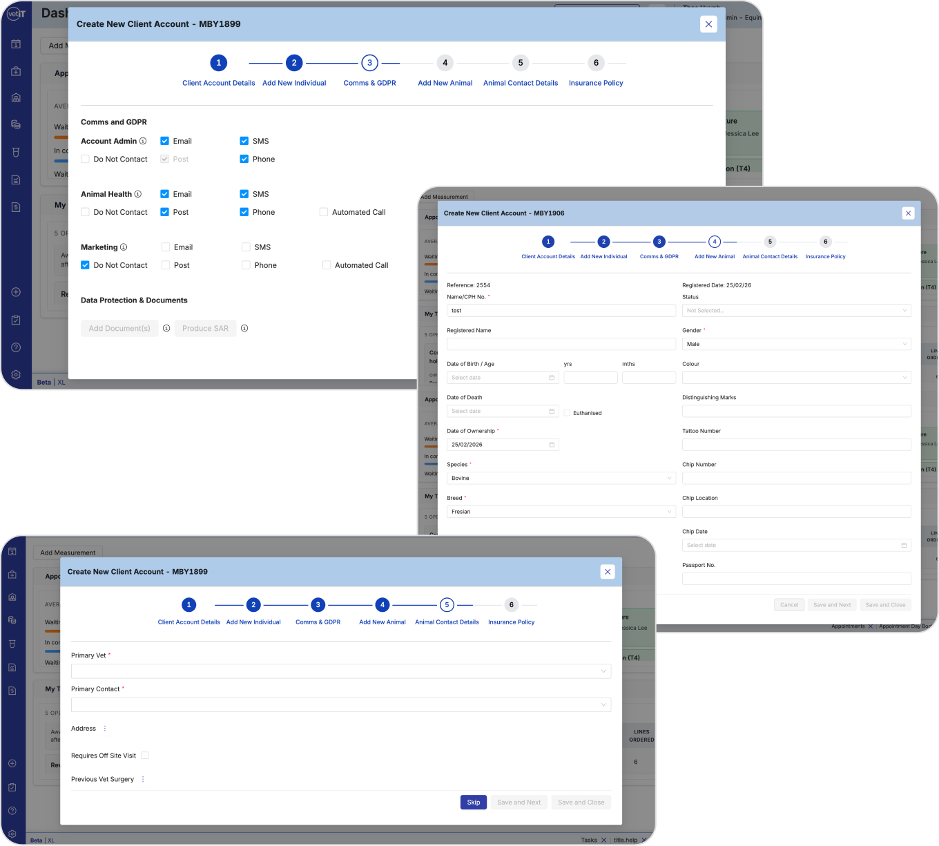
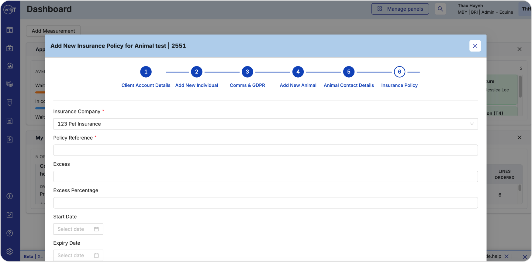
I conducted a heuristic evaluation of the full Add New Client flow — a 6-step modal process covering client account details, individual contact info, communications and GDPR consent, animal details, animal contact details, and insurance policy setup.
Each issue identified was:
Tied to a specific, named heuristic or UX principle (e.g. Hick's Law, Miller's Law, Law of Proximity, Fitts's Law, Tesler's Law, or one of Nielsen's 10 heuristics)
Rated by severity — High (prevents task completion, causes data loss, or poses a compliance risk), Moderate (complicates a task or creates confusion), or Minor (cosmetic, low impact)
Paired with a specific, actionable recommendation
What I found, and what I recommended
What was working
I want to highlight the strengths first — the existing flow wasn't without good decisions, and it's worth acknowledging what was already working before critiquing what wasn't.
Clear progress indicator — the 6-step tracker (Goal-Gradient Effect / Visibility of System Status) gave users a clear sense of where they were and what was left.
Consistent form design — input styling was predictable across all 6 steps (Jakob's Law / User Control & Freedom).
Button design and placement — primary actions were large, easy to interact with, and consistently placed (Fitts's Law / Flexibility & Efficiency of Use).
High-severity issues I identified
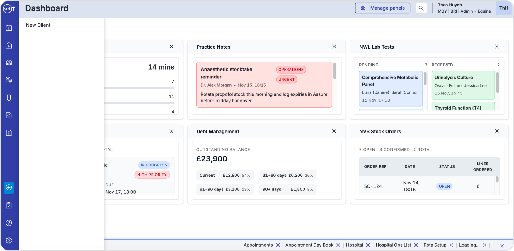
Ambiguous Entry Point
Heuristic: Visibility of System Status / Discoverability
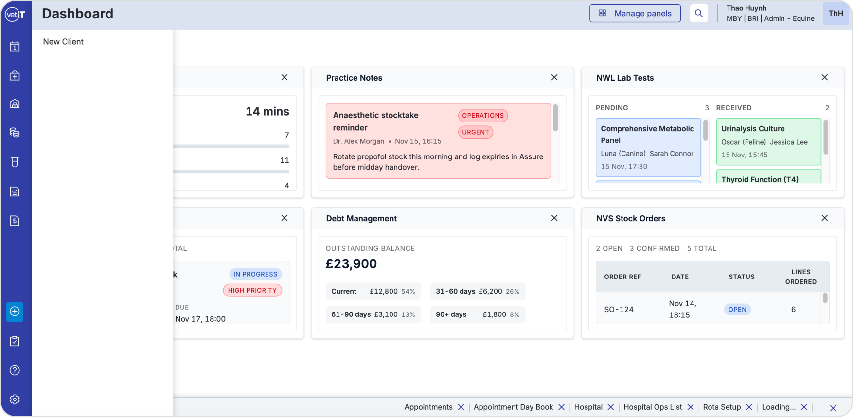
The only way to add a new client was through an unlabeled '+' icon in the sidebar, which revealed a small, unstyled dropdown menu rather than navigating to a dedicated space.
Staff unfamiliar with the system had no visual cue that this icon led to client creation, and the dropdown overlapped existing dashboard content instead of replacing it — making the interaction feel like a temporary overlay rather than a real destination.
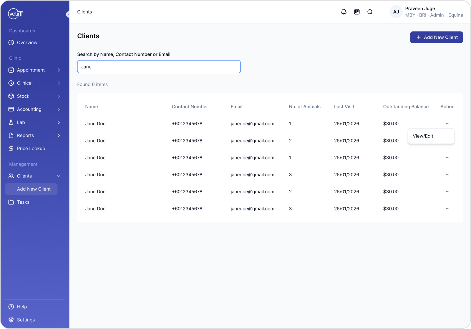
Recommendation: replace this with a dedicated Clients page, accessible from primary navigation, with a clearly labeled '+ Add New Client' action — giving staff a predictable, discoverable place to manage client records instead of relying on icon recognition.
Section Separation
Heuristic: Aesthetic & Minimalist Design
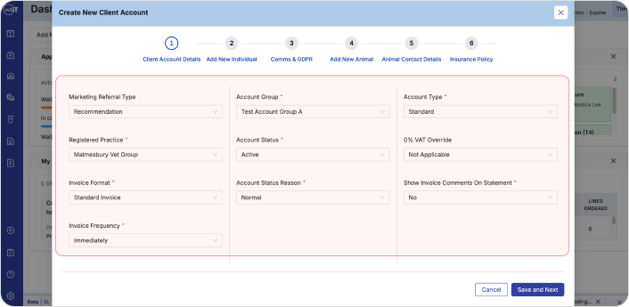
All fields on the Client Account Details step were presented in a single unstructured column, with billing settings (invoice format, frequency, VAT override) mixed in with personal/account details.
These belong to different contexts and mixing them made the page difficult to scan.
Recommendation: separate billing settings into their own clearly labeled section.
Ambiguous Consent Fields
Heuristic: Error Prevention, WCAG
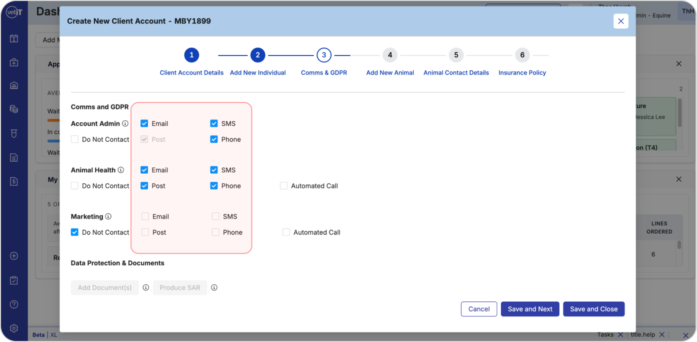
GDPR consent fields used checkboxes, which don't distinguish between 'declined' and 'not yet answered' — a legally significant difference under UK GDPR that a checkbox's binary state can't represent.
An unchecked box can mean either 'no' or 'not seen yet,' creating compliance risk.
Recommendation: replace with explicit Yes/No selection, forcing a deliberate choice rather than defaulting to an ambiguous unchecked state.
Communication Matrix Hierarchy
Heuristic: Law of Proximity
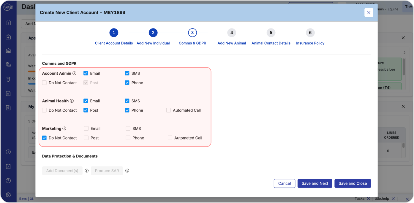
Three communication categories (Account Admin, Animal Health, Marketing) had no clear visual separation.
This made it easy for staff to apply a setting to the wrong category by mistake.
Recommendation: restructure as a clear matrix with each category as a distinct row.
Moderate / other notable issues
Too Many Steps (Hick's Law) — 6 steps for a single task increased cognitive load; recommended merging related steps down to 4.
Age Field Behavior (Tesler's Law, Error Prevention) — Date of Birth and Age were both manual entry fields, risking conflicting clinical data when Age should always derive from Date of Birth.
Animal Field Grouping (Law of Proximity) — identification fields (chip number, tattoo number, passport no.) were mixed in with basic fields like pet name and color, with no dedicated section.
From findings to a hi-fi proposal
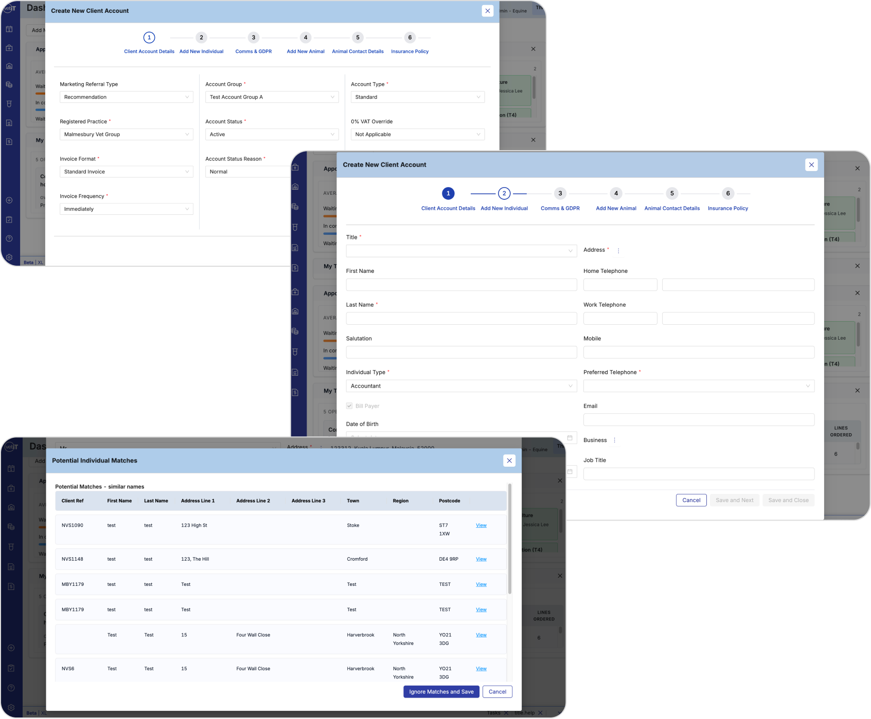
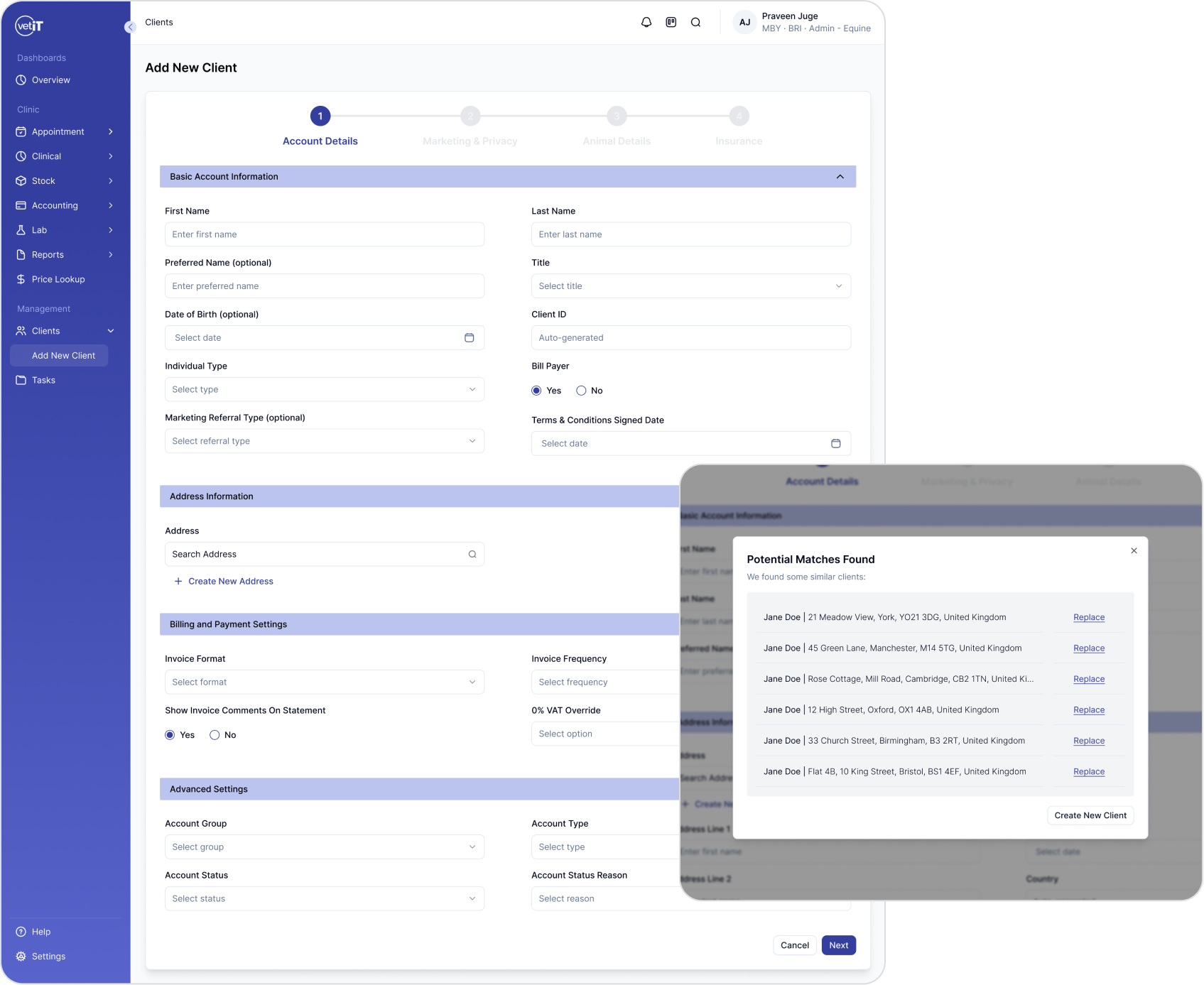
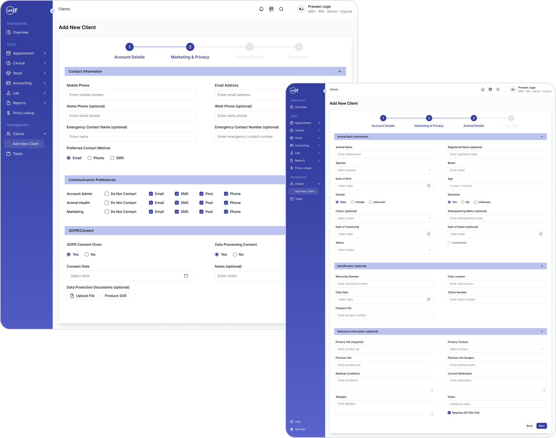
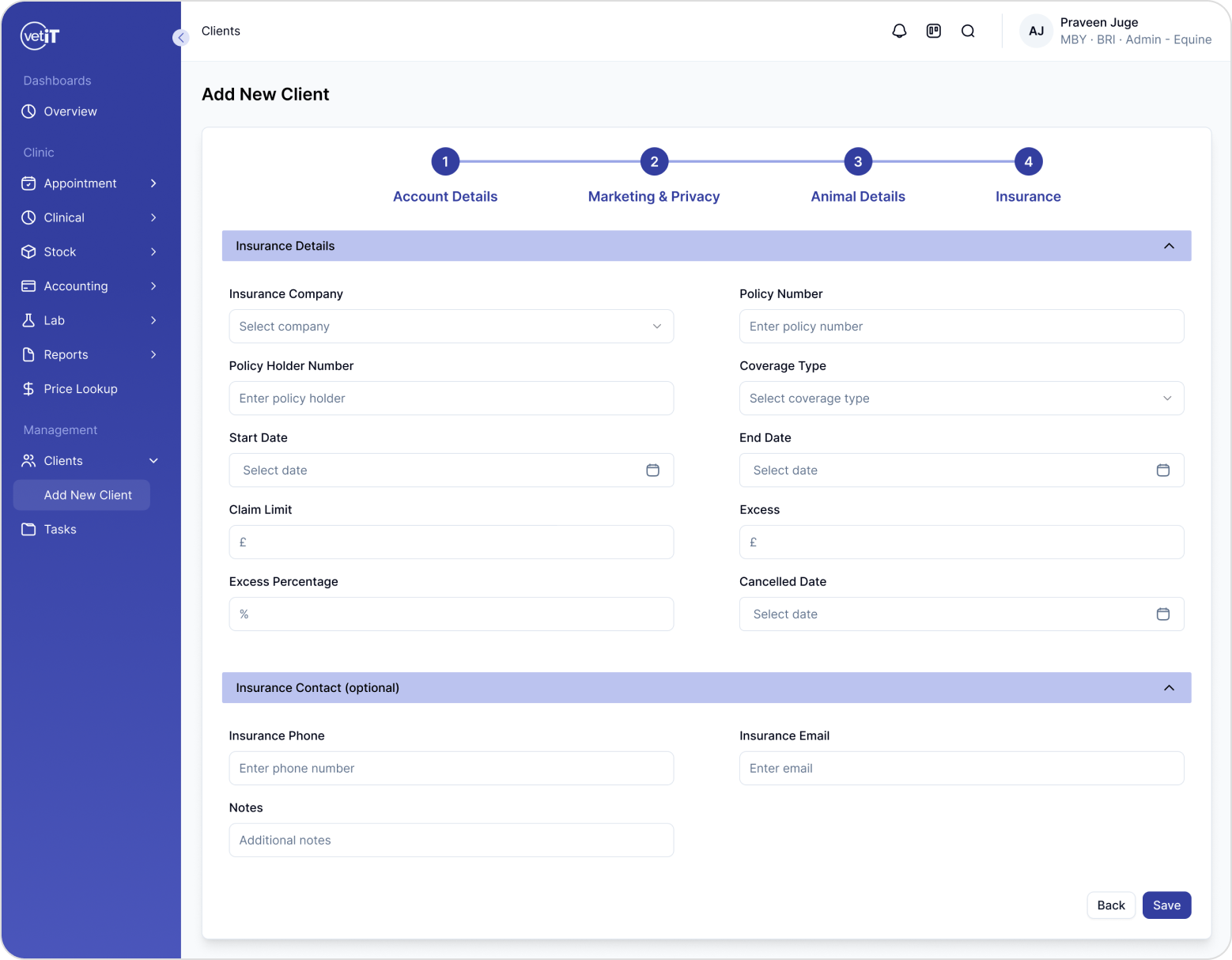
Alongside the audit, I designed a hi-fi redesign proposal to demonstrate how these findings translate into an improved experience — not just describing fixes, but showing them.
Key changes reflected in the redesign
Replaced the hidden sidebar shortcut with a dedicated Clients page and a clear '+ Add New Client' action.
Reorganized the form into labeled sections with explicit Yes/No consent fields and fewer steps.
Added visible address search, auto-calculated age, earlier duplicate detection, and grouped identification fields.
What I learned
Doing this audit reinforced how much of "good UX" in enterprise tools comes down to grouping and sequencing — most of the issues I found weren't about visual polish, but about when information was requested and how related fields were grouped.
It also gave me practice defending design decisions with named, established principles rather than just instinct, which has changed how I explain my own design choices since.