GL App & Admin — Resident Lifestyle App & Admin Platform
Designing new features within an established design system for Gamuda Land's resident app and admin platform.
- Role
- UI/UX Design · Mobile & Web
- Client
- Gamuda Land
- Team
- 4 designers
- Year
- 2025-2026
Overview
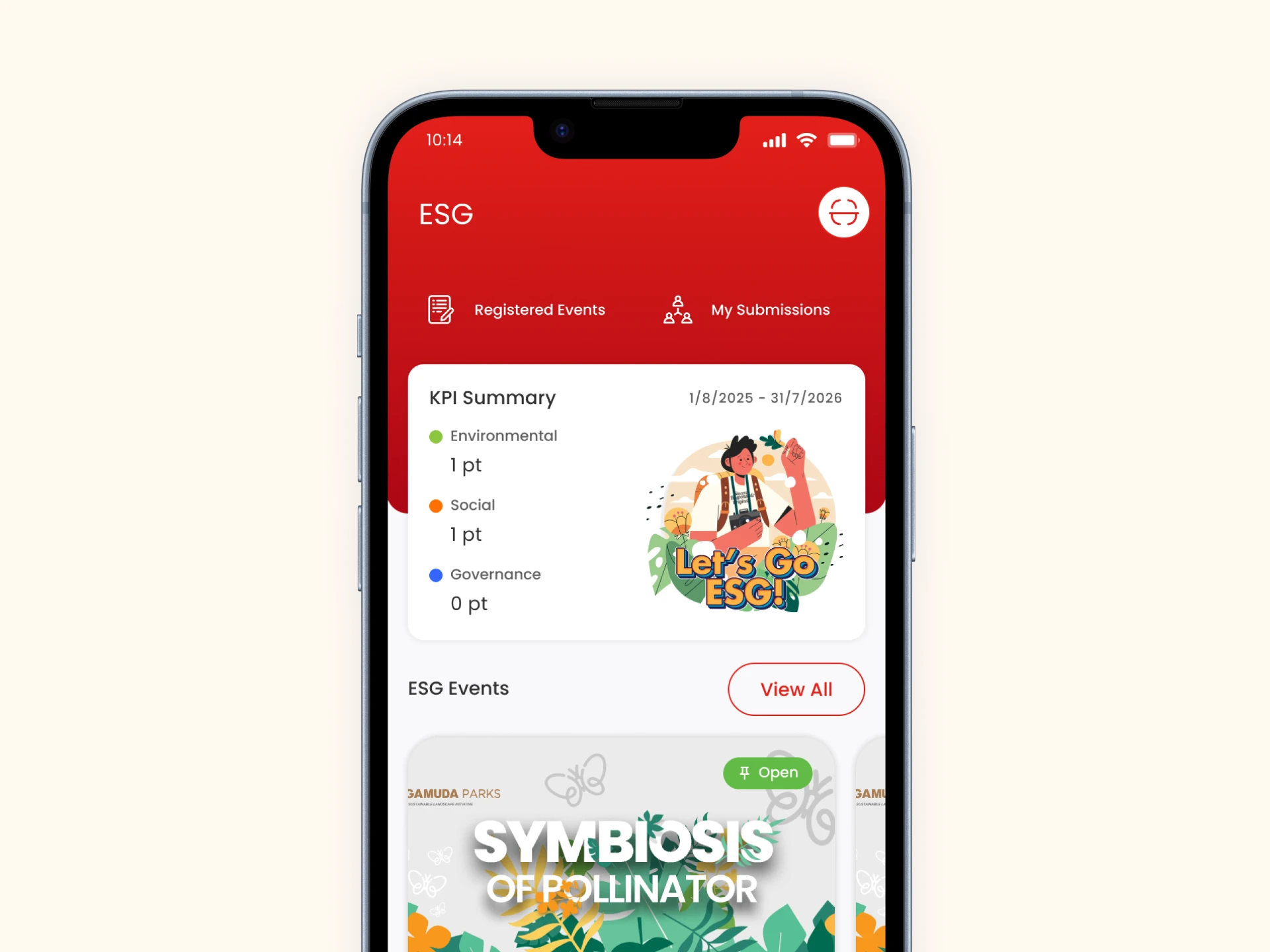
At Madison, I worked as part of an 8-person UX team redesigning GL App and GL Admin for Gamuda Land — a large-scale consumer property app paired with an internal admin platform used to manage its content. I joined the project partway through, after the core structure and design system had already been established, and worked within that system across two specific areas: the ESG page (KPI Summary card and ESG Events carousel) and Events & Happenings.
Context / Opportunity
Gamuda Land introduced a CSR-style ESG initiative for employees, and needed a dedicated space within GL App where employees could track their participation. Unlike a redesign with known pain points, this was a net-new page with no prior version. The team's job was to define, from scratch, how this initiative should appear and function inside an app residents and employees were already using — meaning it needed to feel native to the existing product, not bolted on.
Constraints & Approach
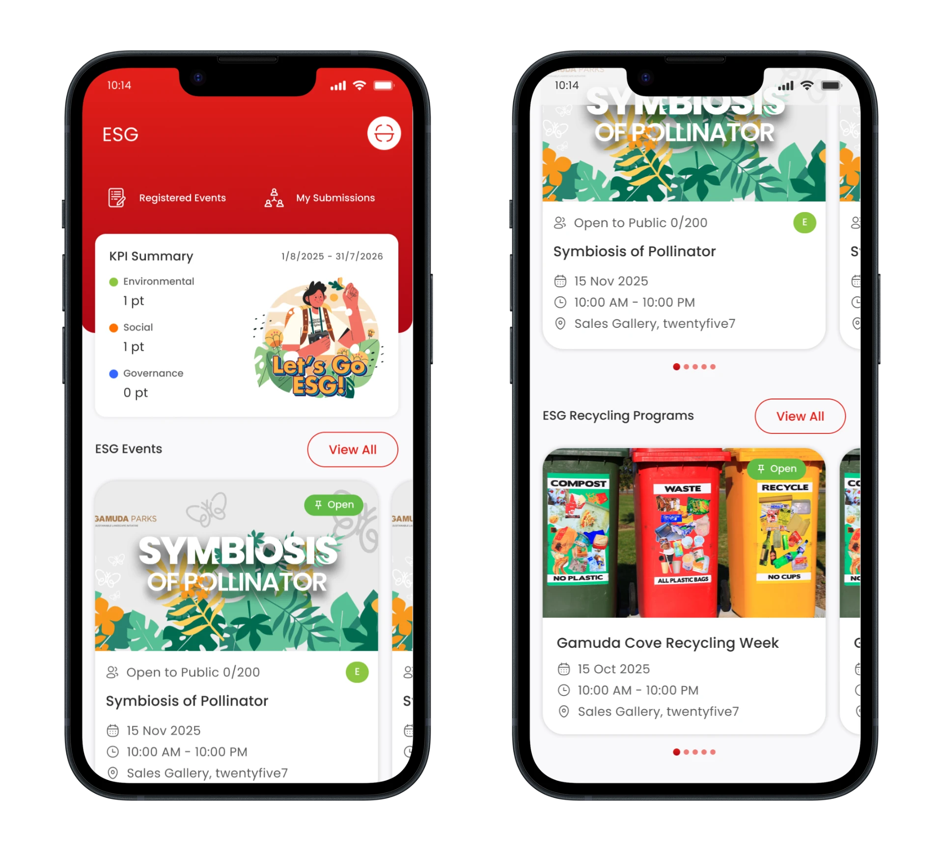
Two different working conditions shaped this case study's two features. The ESG page was brand-new, with section ownership split across the team: I owned the KPI Summary card and the ESG Events carousel, while a teammate owned the ESG Recycling Programs section. The overall page structure and top navigation were team decisions. Events & Happenings was an existing feature already live in GL App/Admin; my work was to design the App-side browsing/detail experience and the Admin-side event-creation form, using the existing Admin content-management pattern and a requirements document provided by a Business Analyst.
What I decided, and why
ESG Events Carousel
Choosing a carousel over a vertical list
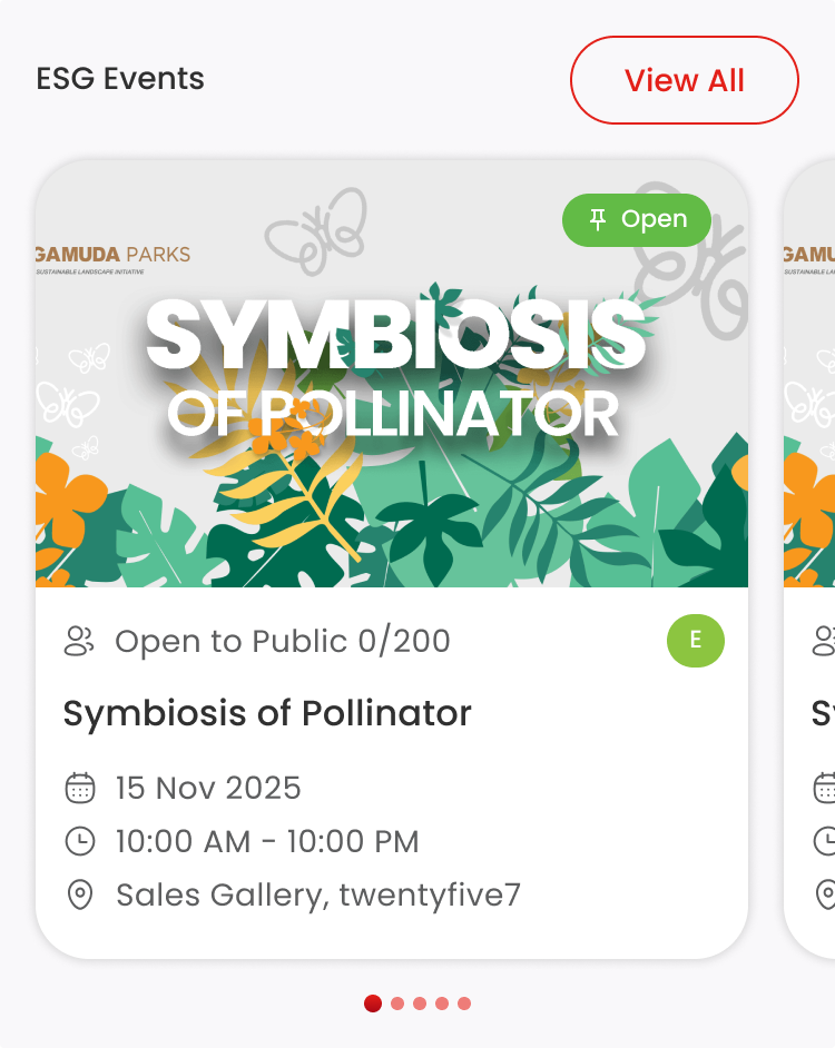
The ESG landing page already stacked multiple sections vertically — KPI Summary, ESG Events, ESG Recycling Programs — so a full vertical list of events risked pushing the Recycling section too far down the page. I used a horizontal, swipeable carousel with dot pagination instead, letting users browse several events quickly without extending the page unnecessarily.
Deciding what information appears on the card
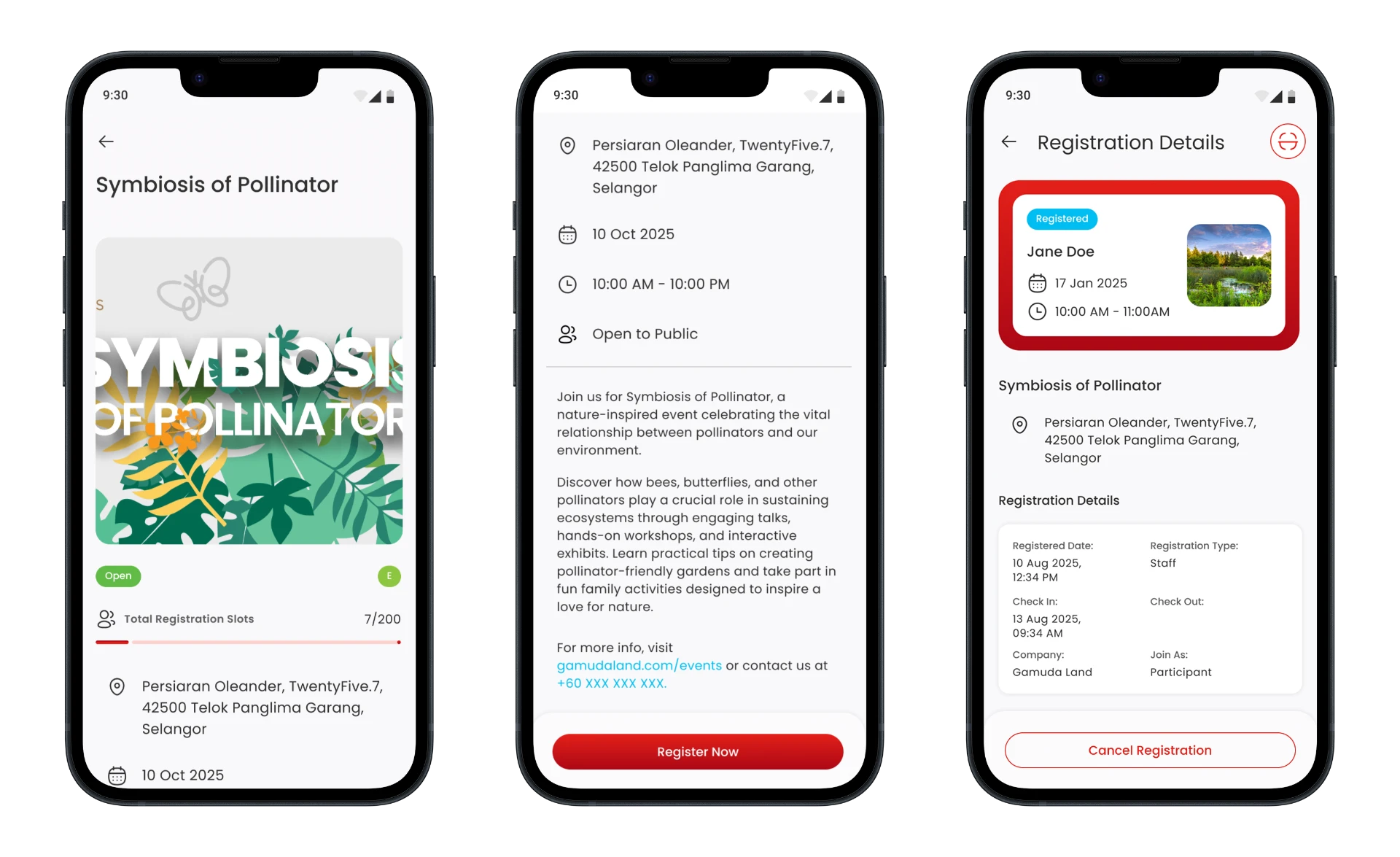
Each event card needed to answer the questions a user has before deciding to register: status (Open), capacity (e.g. 'Open to Public 0/200'), category, title, date, time, and location. I prioritized these because they're the minimum information someone needs to judge relevance and availability at a glance.
Handling full-capacity events
When an event reaches its registration limit, the card grays out and moves to the bottom of the carousel. This keeps the carousel's prime, easily visible positions reserved for events users can still act on, and the grayed-out state communicates unavailability before a user commits to tapping.
KPI Summary Card
Visualizing three categories at once
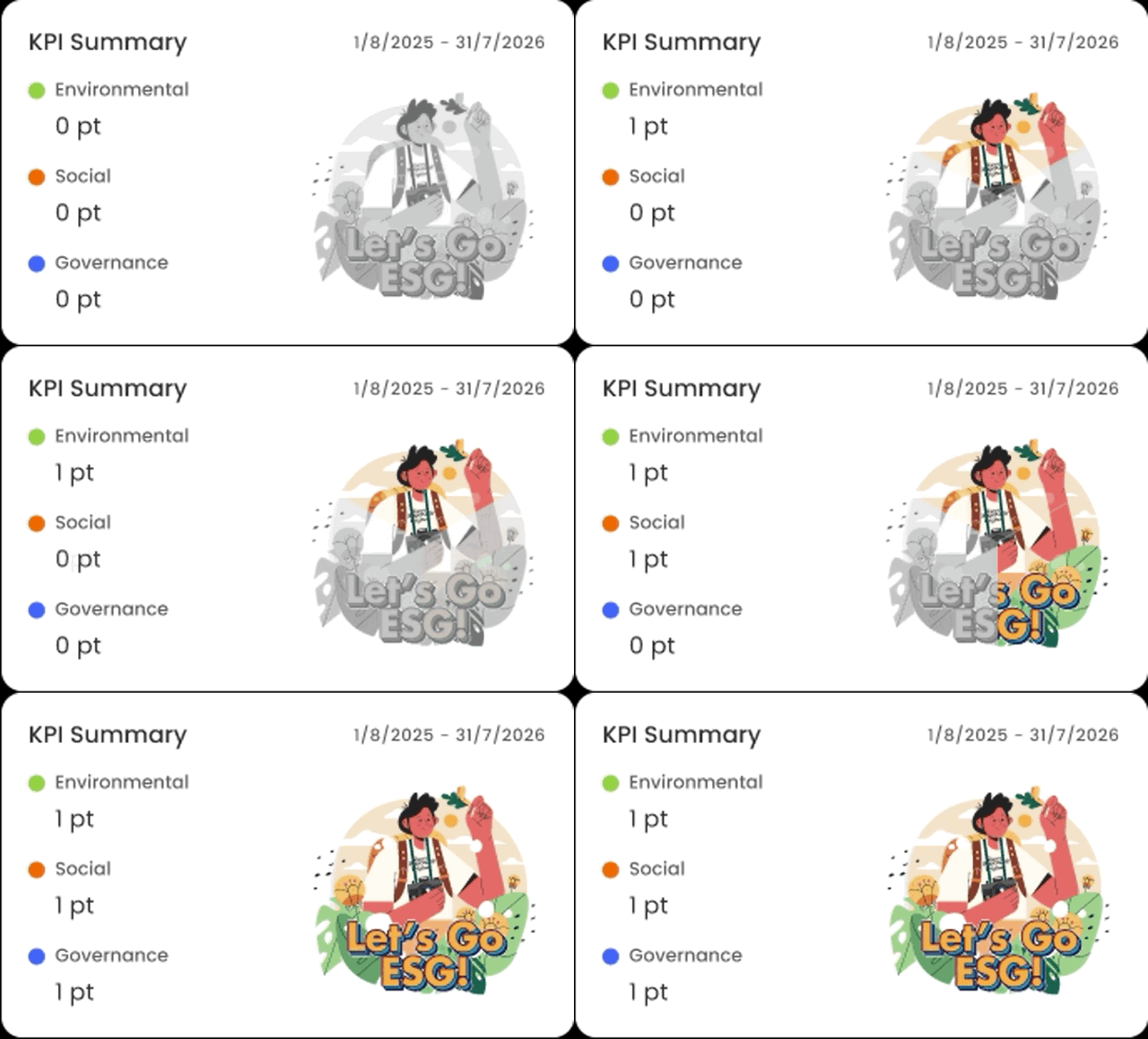
Rather than a table or bar chart, I used color-coded category dots paired with a point value for each of the three pillars. This kept the summary compact and scannable, while making each category individually identifiable through consistent color-coding used elsewhere on the page.
The proportional-fill logo
The ESG illustration on this card fills proportionally based on points earned per category — a single point in Governance colors in only a small portion of that segment, while categories with zero points remain uncolored. This turns an otherwise abstract point count into an immediate, at-a-glance visual of progress.
Selected visuals
Events & Happenings
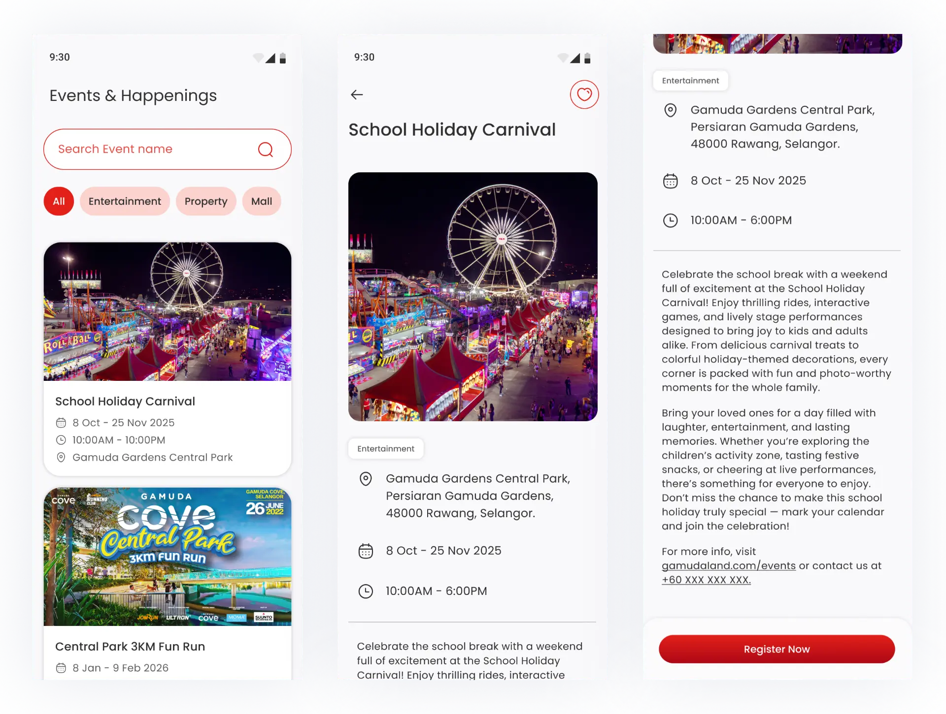
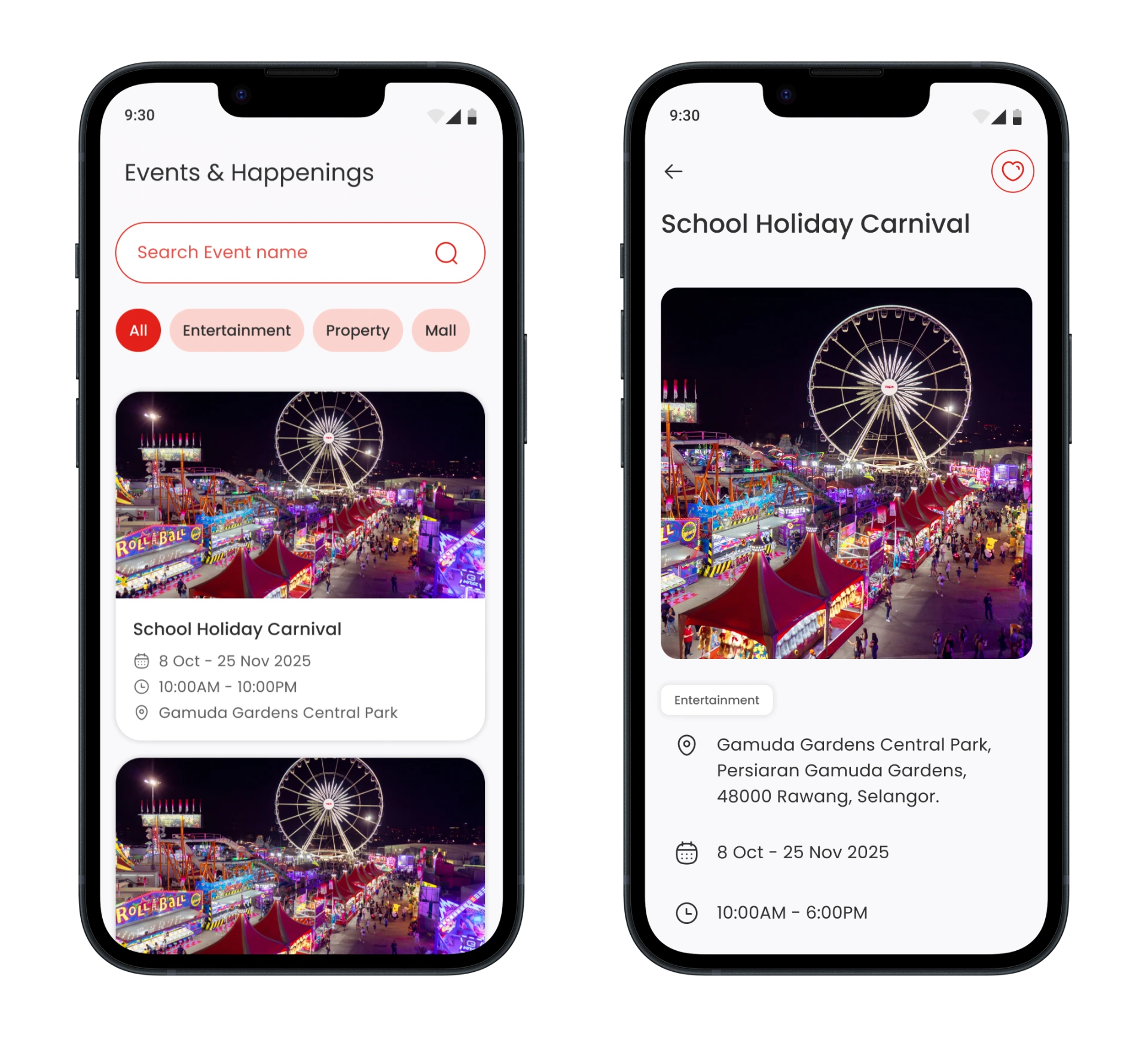
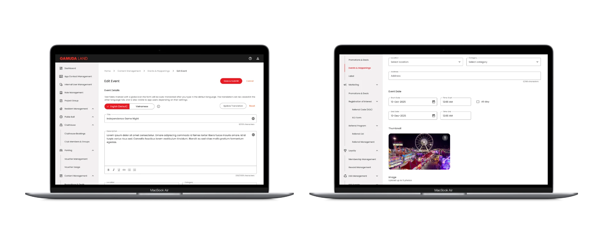
Alongside the ESG page, I designed the App-side experience and Admin-side creation form for Events & Happenings, an existing feature in GL App/Admin. On the App side, I designed the event listing page (with search and category filtering) and the event detail page. On the Admin side, I adapted the existing content-management form pattern — originally built for Promotions & Deals — to fit event-specific fields such as date ranges, time windows, and an optional registration link, working from a requirements document provided by the project's Business Analyst.
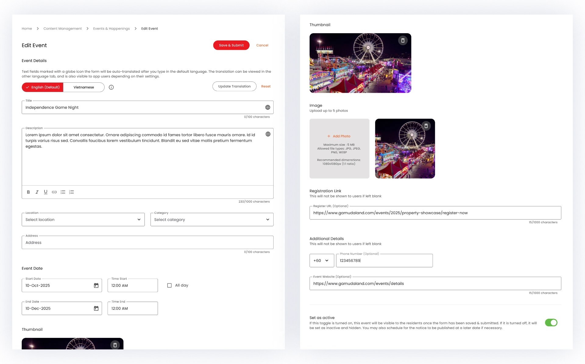
While the form pattern and most fields were already established or specified, my work involved deciding how event-specific additions (like the Event Date section, with its Start/End Date and Time fields) should be laid out within the existing form structure, and ensuring the new content type stayed visually and functionally consistent with the rest of Admin.
What I'd revisit
If I were to revisit this work, I'd want to validate whether the "1 pt" framing on the KPI Summary card is actually being interpreted correctly by employees — whether they understand a low point count reflects rarity/difficulty rather than poor performance. This wasn't something we had a chance to user-test given the project timeline, but it's a good example of a small piece of copy or microcopy that could meaningfully change how the feature is perceived.