DMM — Defect Management Dashboard
Scaling an existing dashboard to surface more defect data without collapsing into visual noise.
- Role
- UI/UX Designer
- Tools
- Figma
- Team
- 2 designers
- Client
- Gamuda Land
- Year
- 2026
Overview
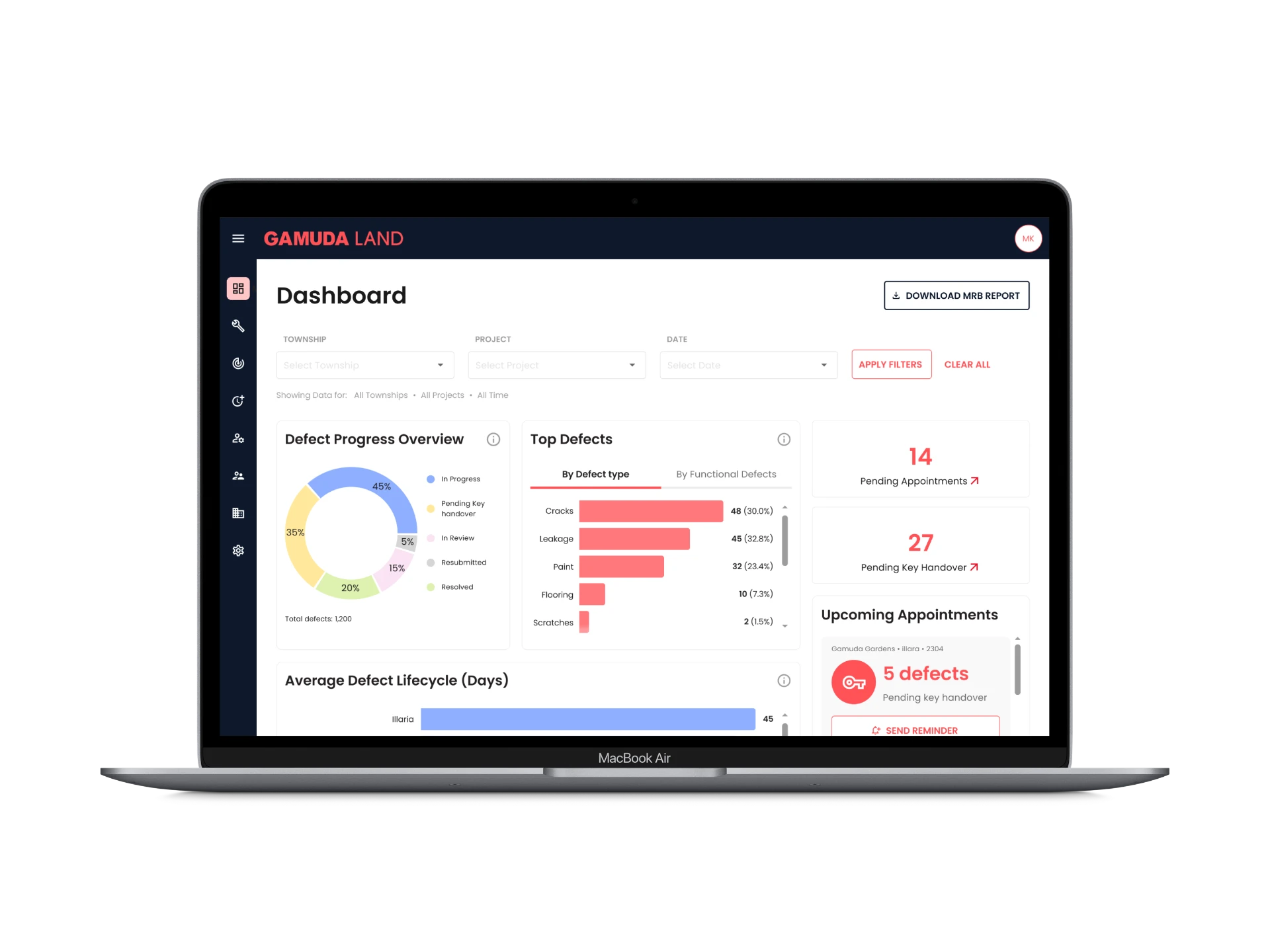
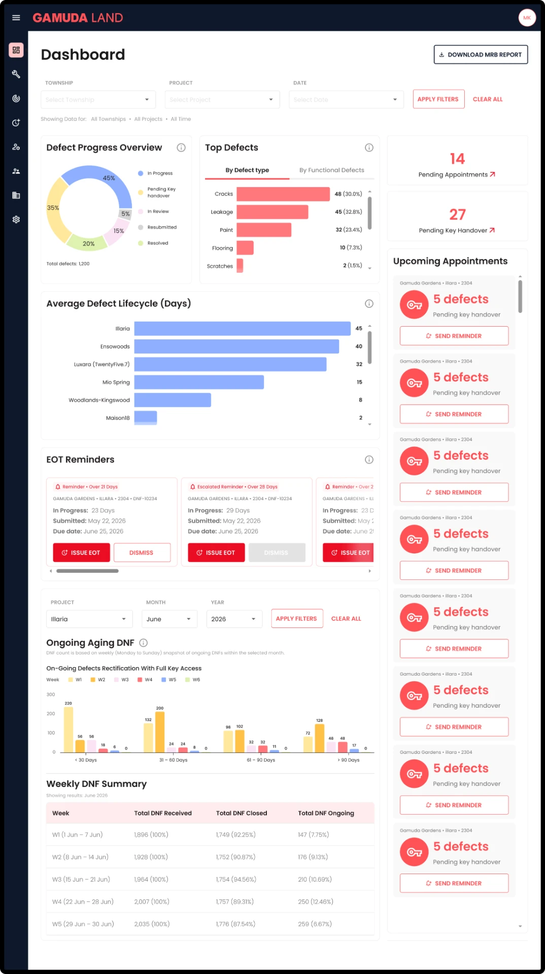
DMM (Defect Management System) is a dashboard product I worked on at Madison for Gamuda Land, used to track and manage property defects across multiple townships and projects. My work centered on the main Dashboard screen, where the client requested a significant expansion of the data being surfaced — more charts, more granular breakdowns, and more at-a-glance stats than the dashboard originally showed.
This case study focuses on how I approached fitting substantially more information into an existing dashboard without letting it collapse into visual noise — a common but under-discussed UX problem: not designing a screen from scratch, but scaling one that already works.
Context / Opportunity
The client requested that the DMM dashboard surface considerably more defect data than it originally did — including defect progress breakdowns, defect-type analysis, lifecycle timing per project, aging trends, and weekly summaries. The challenge wasn't generating this data (that came from the client's requirements), but figuring out how to structure a single dashboard page so that all of it remained scannable rather than overwhelming, given how information-dense the result would necessarily be.
What I decided, and why
Choosing chart types based on what each dataset needed to communicate
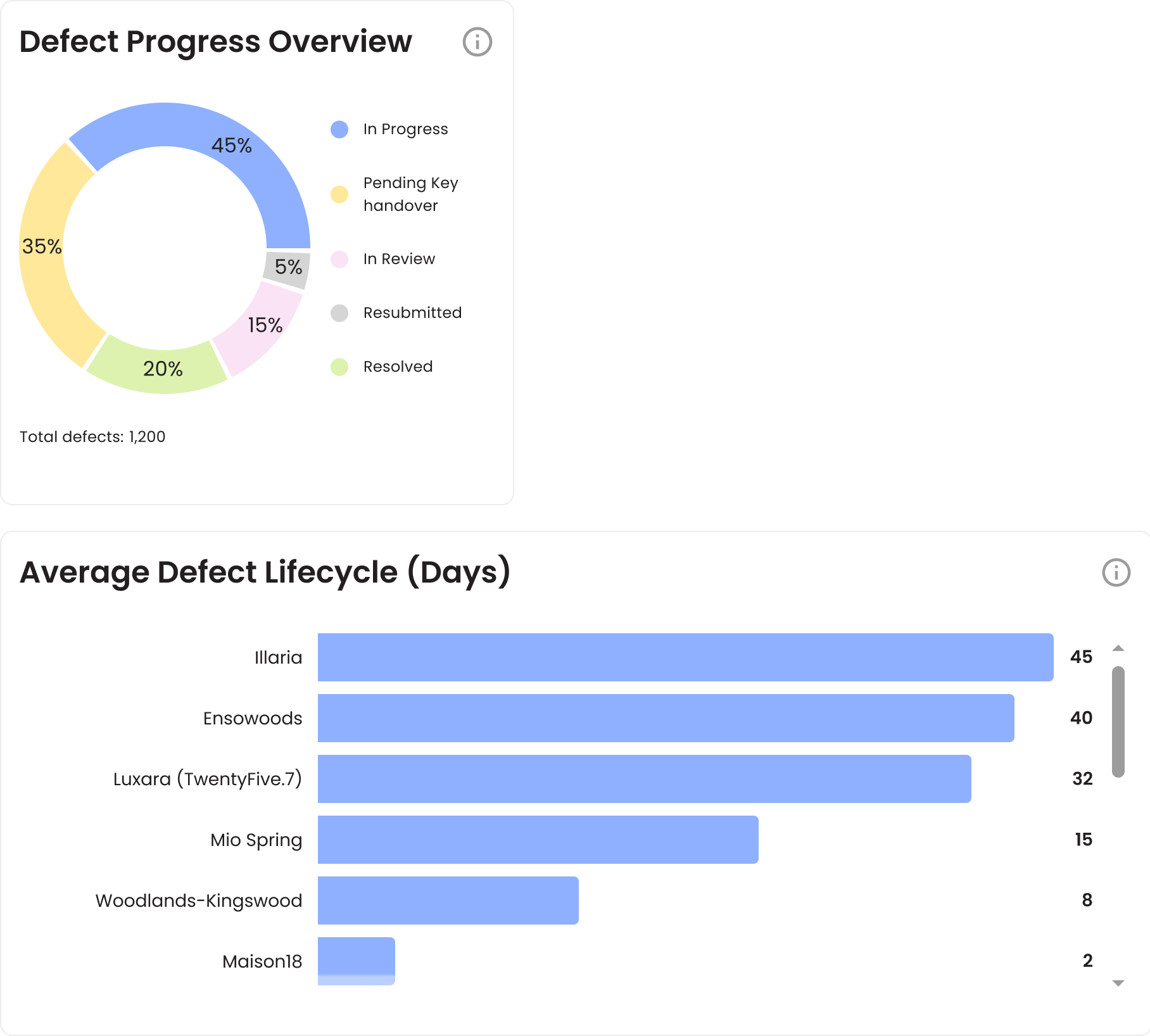
Donut for part-to-whole relationships
I used a donut chart for the Defect Progress Overview because it's showing proportions of a whole — In Progress, Pending Key Handover, In Review, Resubmitted, and Resolved — all adding to 100%. That shape is suited to part-to-whole relationships.
Horizontal bars for ranking and comparison
For Top Defects and Average Defect Lifecycle, I used horizontal bar charts instead. Those datasets are about ranking and comparing discrete values: which defect type has the most occurrences, and which project has the longest average lifecycle. That format reads more clearly for comparison than a donut would.
Consolidating related views into tabs
One component, two views
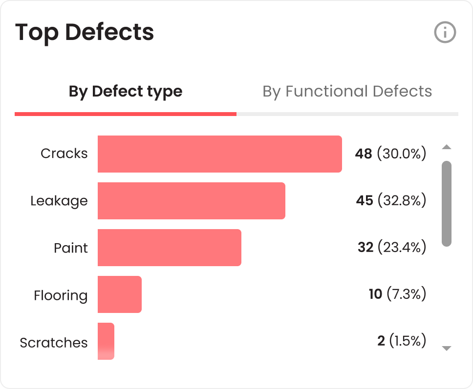
Top Defects needed to show data two ways — 'By Defect Type' and 'By Functional Defects.' Rather than giving each its own separate chart on an already dense page, I combined them into a single chart with a tab switcher.
Saving vertical space without losing information
Since both views represent the same underlying issue from two angles, keeping them in one component saved significant vertical space. The user can toggle between them rather than scrolling past two nearly-identical-looking charts.
Splitting filters by scope, not consolidating everything into one control set
Two filter bars for two different grains of data
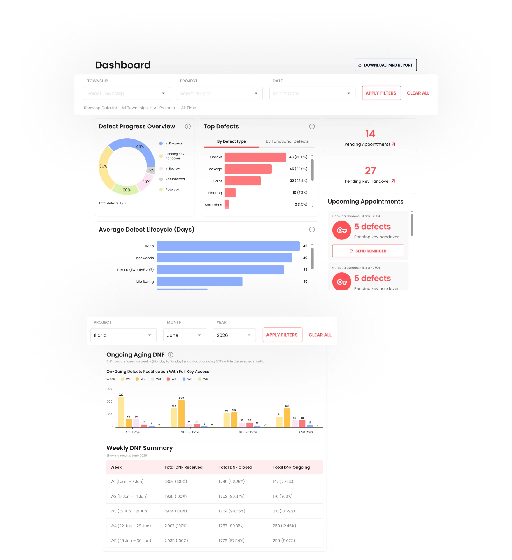
The dashboard has two separate filter bars: a top-level filter (Township/Project/Date) governing the broader dashboard sections, and a second, more granular filter (Project/Month/Year) specifically for the Ongoing Aging DNF chart and Weekly DNF Summary table further down the page.
Why they couldn't be merged
I kept these separate because the lower section's data is inherently time-bucketed at a weekly/monthly grain, which doesn't map cleanly onto the broader, more general top-level filter. Combining them risked being either too coarse for the weekly breakdown or too granular for the rest of the dashboard.
Reusing existing components where nothing needed to change
Leaving well-functioning sections alone
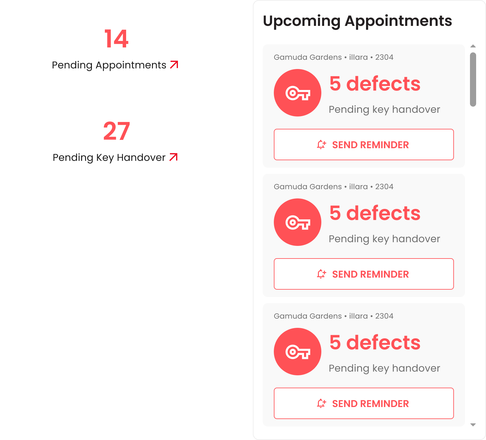
The Upcoming Appointments list and EOT Reminders section remained as they were. I didn't rework them, since they weren't part of the client's new requirements and were already functioning well within the page.
Knowing what not to redesign
Recognizing what didn't need to change was as much a part of managing this expansion as deciding how to fit in what did. Not every screen needs a redesign — sometimes the right decision is to preserve what's working and focus attention where new value is being added.
Full Dashboard
What I learned
Working on this taught me that scaling an existing screen is a different discipline from designing a new one — the constraint isn't a blank canvas, it's protecting the clarity of something that already works while making room for legitimately more information.