Connected Builder System — Form, Workflow & Module Design
Turning three disconnected configuration tools into one intentional, connected workflow — from form to process to published module.
- Role
- UI/UX Design · Web
- Tools
- Figma Make
- Team
- 2 designers
- Year
- 2026
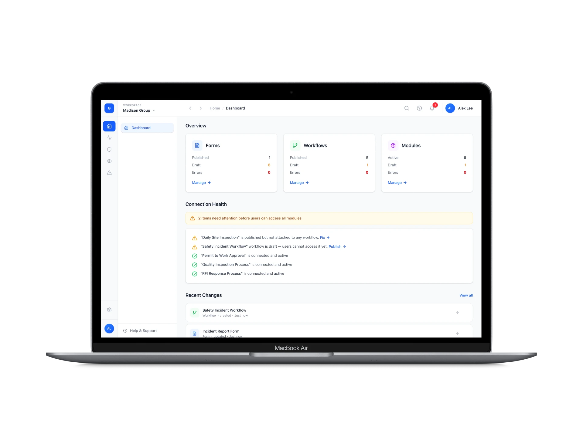
Overview
I worked alongside a colleague, in close collaboration throughout, on the UI/UX for a configurable enterprise platform used to manage operational processes (safety, quality, compliance-style workflows) for large organizations. Rather than shipping individually developed, hard-coded modules for each use case, the platform's next version was designed around a set of reusable building blocks that administrators can configure themselves, without needing developer support.
This case study focuses on the part of the system we designed together: the builder experience — specifically the Form Builder, Workflow Builder, and Module Builder — the tools an administrator uses to define what data is captured, what happens to that data afterward, and how it all comes together into a usable module.
[Note: this was fully collaborative work between me and a colleague — decisions throughout were made together, so this case study is written in first-person plural where appropriate.]
Context / Opportunity
In the platform's previous version, these builders existed, but functioned independently of one another — there was no clear, enforced relationship between building a form, building a workflow, and assembling a module. An administrator could create all three, but the system didn't make it obvious how they were meant to connect, which made the builder experience feel disjointed for anyone assembling a new module from scratch.
For this version, our goal was to make that relationship explicit: build a form, attach it to a workflow, then bring everything together in the module builder — a deliberately sequential, connected process instead of three separate, loosely related tools.
Process & Tooling
This entire project was designed in Figma Make, rather than starting in traditional Figma and prototyping separately — every screen shown here was built directly through that workflow. Before designing any detailed screens, we first defined the design system together — colors, typography, and core visual language — for two reasons. First, part of the goal of this version was to give the platform a more modern feel compared to its predecessor, so establishing that visual direction upfront gave us a clear standard to build toward across all three builders. Second, working with Figma Make specifically, having a defined visual guideline in place before generating detailed screens made the AI's output far more consistent and usable — rather than getting variation we'd have to manually reconcile screen by screen, the system acted as a constraint that kept everything visually aligned from the start.
What we decided, and why
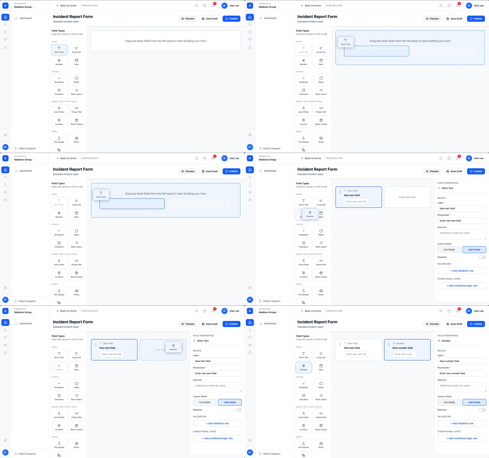
Organizing the Form Builder's field palette by function, not just type
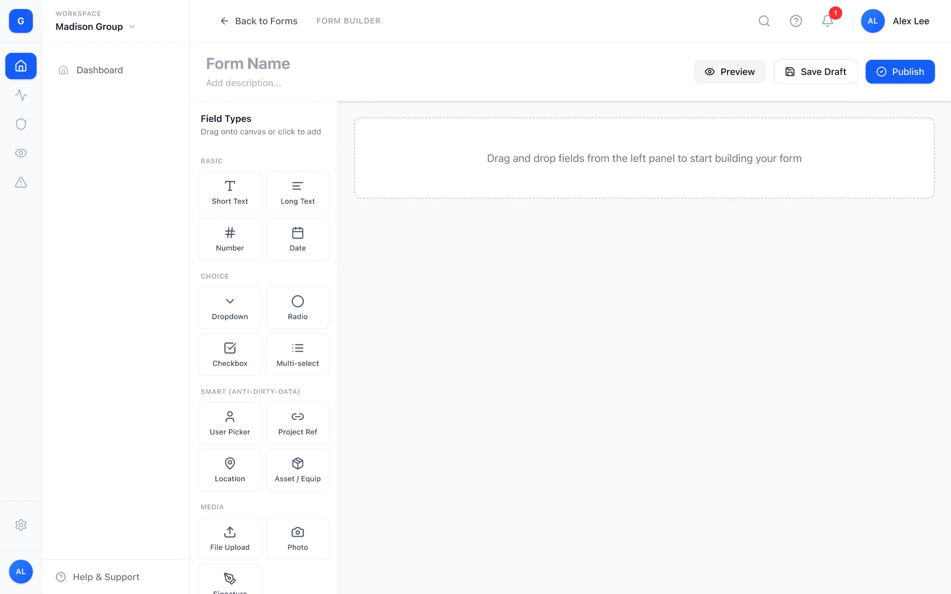
We grouped fields into categories — Basic (text, number, date), Choice (dropdown, radio, checkbox), Smart fields, Media, and Advanced — instead of showing one flat list.
The "Smart" category groups fields like User Picker, Project Reference, Location, and Asset/Equipment, which reference existing system data rather than accepting free text.
Separating these from basic fields makes the distinction visible to admins: these aren't just inputs, they're structured references that keep data consistent across the platform.
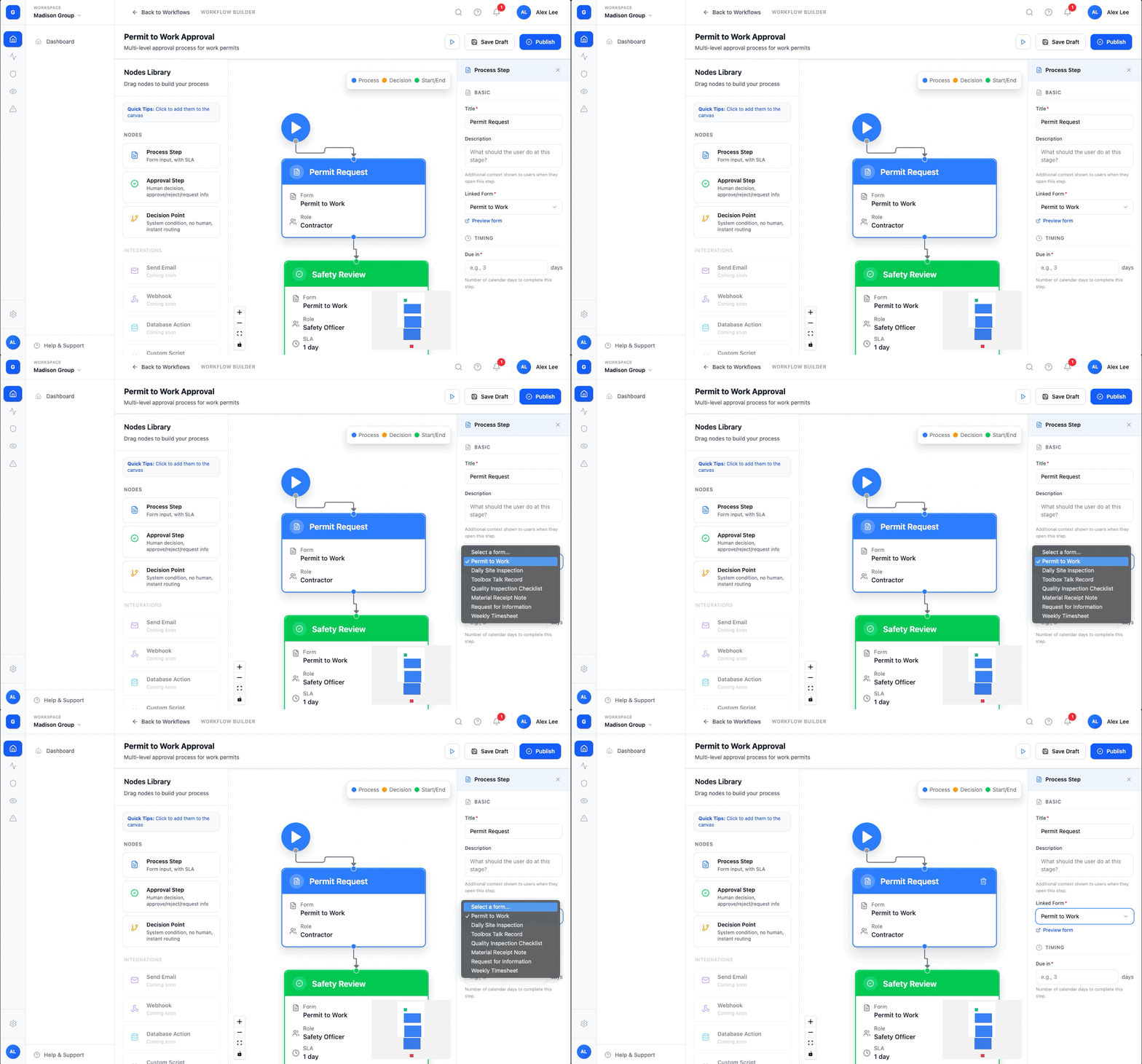
Connecting Form to Workflow through an explicit reference field, not a separate linking step
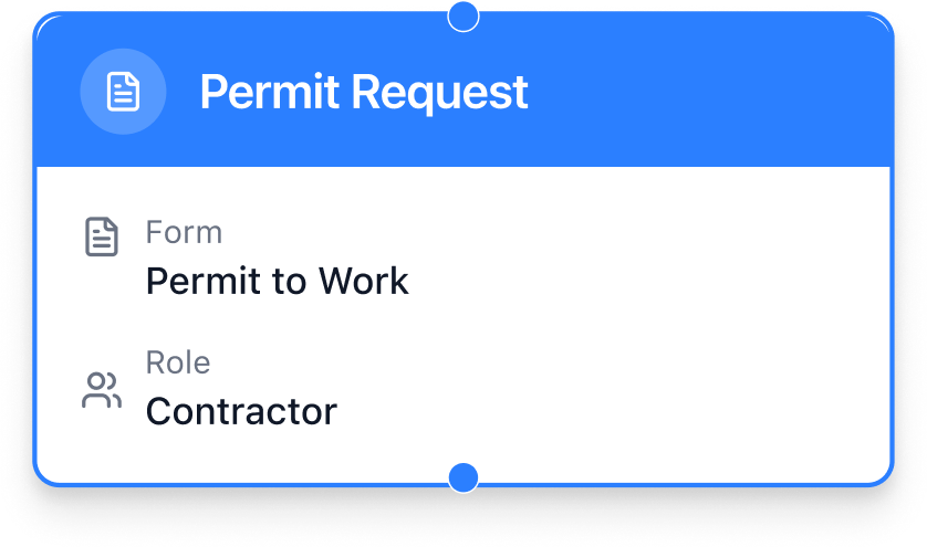
Each process step (e.g. "Incident Report," "Investigation," "Corrective Actions") has a dedicated "Linked Form" field in its configuration panel.
The admin selects which form — built separately in the Form Builder — powers that step.
Embedding the connection directly into the step's settings makes attaching a form feel like a natural part of configuring the step, not an extra task layered on top.
Making the workflow itself visual and legible at a glance
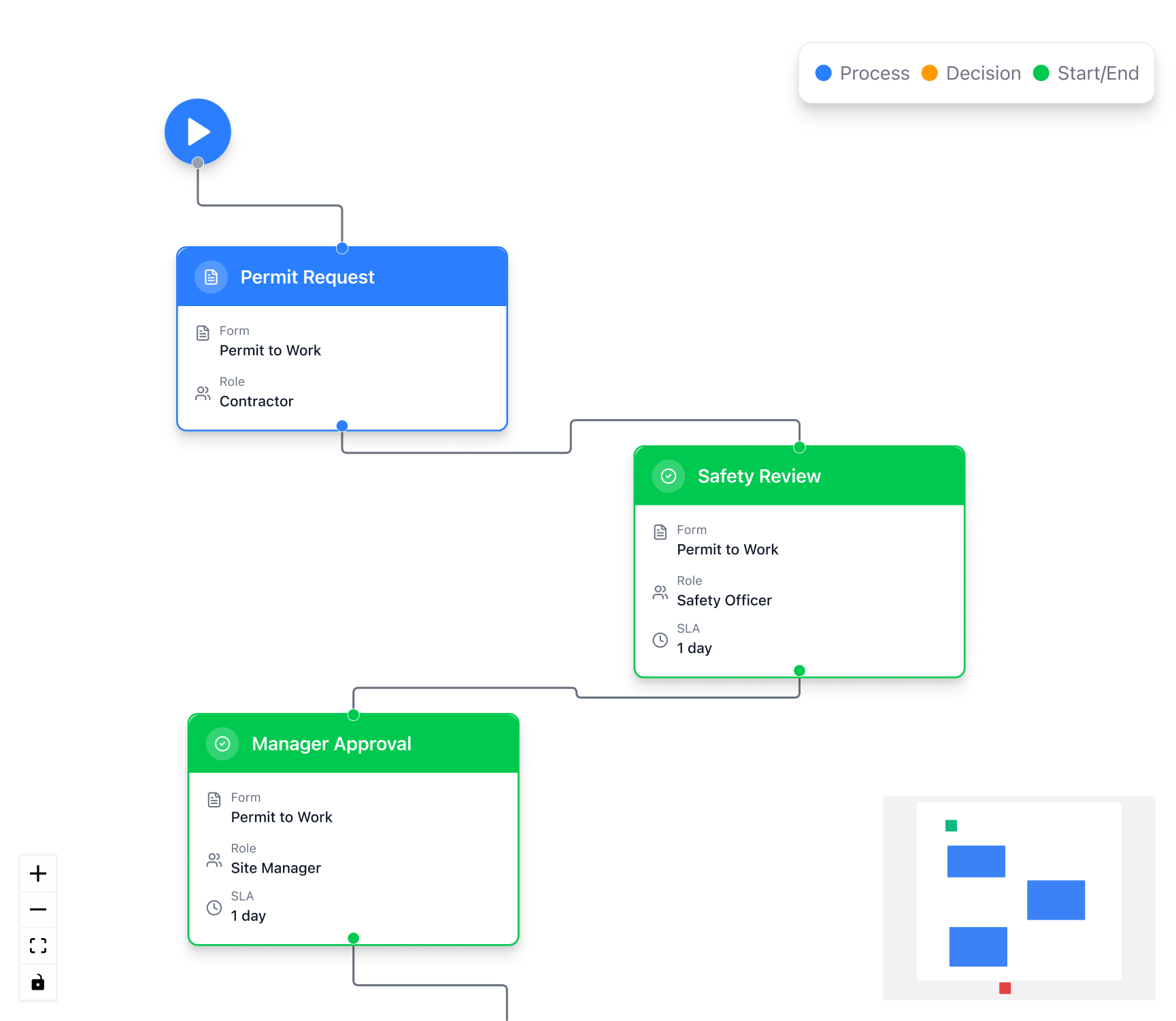
The Workflow Builder represents each stage as a node on a canvas, color-coded by type: blue for Process Steps, green for Approval/Start-End points, and orange for Decision Points.
Nodes are connected in sequence so admins can read the flow's shape without opening each step.
Each node surfaces its key configuration — linked form, assigned role, SLA/timing — directly on the node itself.
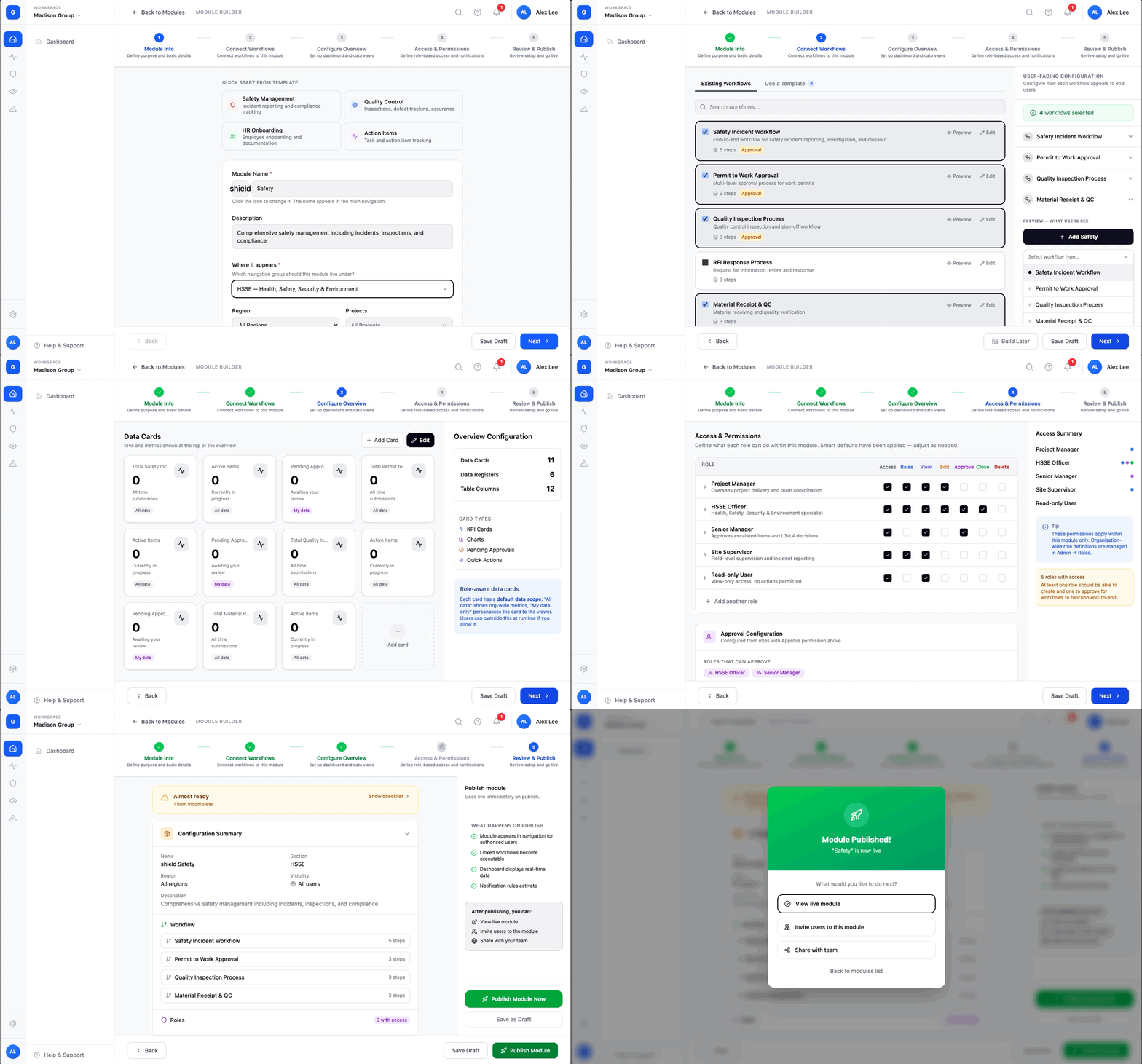
Using a guided, numbered flow specifically for Module Builder — where the connection between builders needed to be made explicit

Module Builder follows a 5-step guided flow: Module Info → Connect Workflows → Configure Overview → Access & Permissions → Review & Publish.
We made this deliberately sequential — rather than another open canvas — because this is where previously-independent pieces (forms, workflows) must be actively brought together into one functioning module.
Small guidance cues, like the "Next: choose or build the workflow that powers this module" note at the bottom of Module Info, make the upcoming connection clear before the admin reaches that step.
Providing quick-start templates to reduce blank-canvas friction
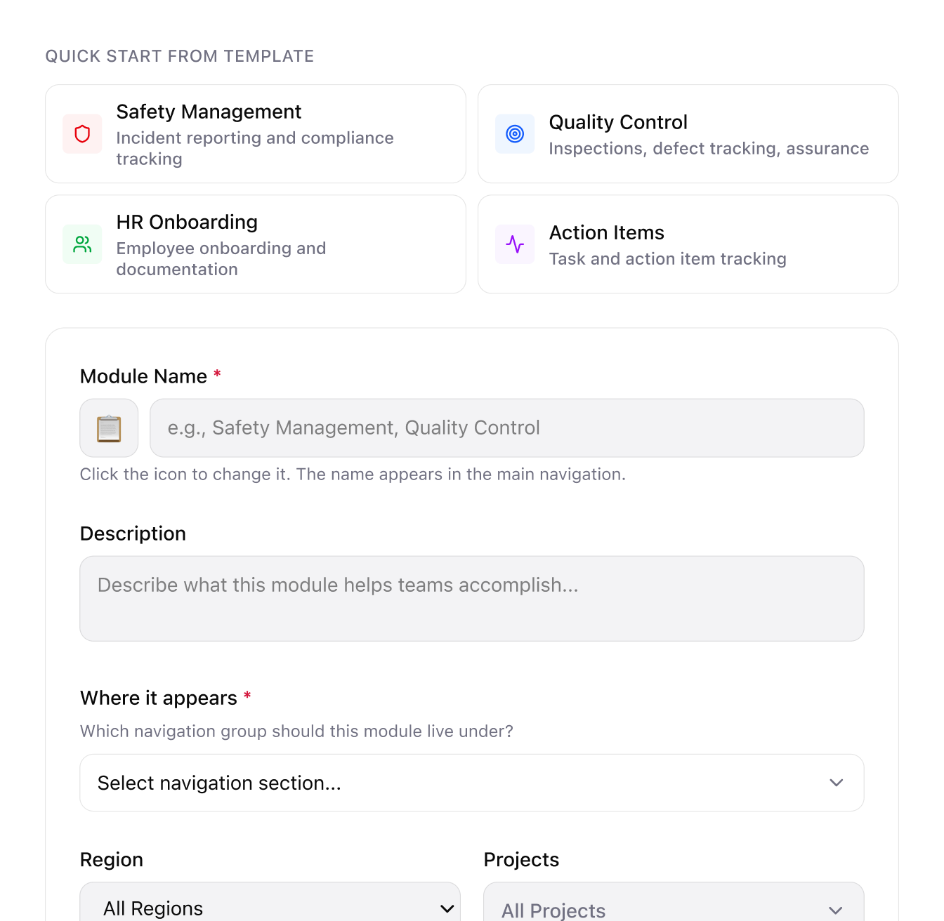
Module Info includes pre-built templates such as Safety Management, Quality Control, HR Onboarding, and Action Items.
Admins can start from a relevant template instead of configuring a module entirely from scratch.
Since Module Builder is the step that ties everything together, templates lower the barrier for admins who don't want to make every structural decision themselves.
Selected visuals
What we learned
This project pushed us to think about UX at a system level rather than a single-screen level — the hardest part wasn't designing any one builder in isolation, it was deciding how three genuinely different tools (a form editor, a visual workflow canvas, and a guided setup wizard) should reference and hand off to each other in ways that felt intentional rather than bolted together.
Working entirely in Figma Make also taught us something about the trade-offs of an AI-first design workflow: while having a design system defined upfront made the AI's output more consistent, generating and regenerating detailed screens still burned through credits quickly, especially during earlier rounds of iteration before we'd fully locked down the structure. In hindsight, I think a hybrid approach would have been more efficient — sketching out structure and flow in traditional Figma first, where iteration is free and fast, and only moving into Figma Make once the layout and logic were more settled, using it to generate polished, on-system screens rather than to explore structural options from scratch. That would have let us treat Figma Make as a production tool rather than an exploration tool, which is closer to what it seems best suited for.